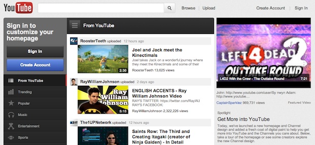
Goodbye cute cat videos, hello cash cow. If browsing YouTube for funny videos is part of your Friday (or Monday, or Tuesday, or ... you get the point) morning routine then you'll already have had a surprise: Gone is YouTube's old cluttered image, with ill-defined boxes of widgets that seemingly blended into other nearby sections of the page. Gone is its use of large sections of white page. Instead, in their place, there's a smooth gray-tinted look and feel to Google's prime video site, and a massive emphasis on "channels" and curated categories.
Google announced last month that it was going to source more professionally made content as well as flow more of its content into Channels--thematically linked sections of the site that would feel a little more like your standard cable TV box perhaps (sports channels, news channels, science...and so on). And it's emphasized on its new blog posting that this redesign is all about that notion. "We want to make it easier for you to find and keep tabs of what you want to watch," it suggests, and glancing down the dark-gray column on the left of the new page that certainly seems true: If you're in the mood for vid clips about music, sports, comedy, science, gaming, and a long list of other topics, they're now collected into an easy-to-access channel.
But this box is also customizable: Sign in to YouTube and you can arrange your own list, alongside Google's curated ones, and the clips it's recommended for you--Google handily points out that you can "even link your YouTube account to Google+ and Facebook to see what your friends are sharing" (and it's notable that Google's falling out with Twitter seems to also extend to this new social link).
Uploaders also benefit from the Channel-centric redesign, and, the site tells us: "As different uploaders have different goals, we've created new Channel templates to meet your needs whether you produce one video a week or have thousands of videos for a fan to browse." To that end Google's noting it's incorporated "feedback from the 'Cosmic Panda' Channels and Watch experiment" (okay, perhaps cute animal videos are not going away) and that it's "excited to present" its range of improvements that also includes "a way to keep your audience engaged even when you don't have new uploads." This last bit seems a very professional-sounding idea, designed to appeal to keen content generators.
And from a user endpoint, the goal is even more obvious: By banishing the chaotic, eclectic colors, segments and detail of the previous design, and making it easier to stay on video topic as well as keeping up with video recommendations from your social network, it's trying to keep viewers on the page for longer. The experience is simply more pleasant and easier to navigate. That's also the job of the new psuedo news-feed segment on the home page--a window that contains content, social activity info, and so on. Like the updating news feed of Facebook or Twitter's rolling updates it creates a sense of dynamism, change...and some detail that pops up in this window is bound to catch the viewer's eye and entice them to engage with the site in some way, perhaps watching one more video.
In the end it's all about money. The more users engage with the site, the more eyes-on-advertising time they give to Google. And by aligning itself as a sort of desktop equivalent to a cable TV, with easily accessible Channels of similar content (albeit a mix of user-submitted and professionally created video) Google is trying to compete with TV on more equal footing. In the light of the redesign the previous YouTube UI looked amateurish, child-like even. What it has now is perhaps the same sort of simple yet powerful interface that users will be familiar with from apps like Instagram or Twitter--much simpler, more accessible, and thus more powerful.
Which makes us wonder if Google has plans to bring this sort of radical makeover to its other services. It recently toyed with the black Google bar on its search page, and has ditched it after a user revolt. And for years Google's look and feel has felt a little stuck in the past, with a very text-centric approach and a graphical style that seemed to have been drawn up by over-enthusiastic engineers rather than artists. Is Google actually growing up, realizing it needs to refine its offerings (as demonstrated by its recent shuttering of Google Labs projects) and add a degree of visual spit and polish that some of its rivals have long surpassed Google in? If you are in a particularly positive frame of mind, you may even see this as proof Google's future Google TV offerings may be a serious entry to what may be a very big connected TV market in 2012.
Chat about this news with Kit Eaton on Twitter and Fast Company too.
No comments:
Post a Comment